Artwork is often added at the end of a project, yet it can be the element that defines how a space feels.
The Art Angle is a considered look at the role original art plays within interiors, from scale and composition to how multiple pieces interact within a room. Alongside this, I share selected works and perspectives from our Journal.
You’re reading the first issue.
If it’s of interest, there’s a subscribe link at the end for future editions.
Clive Wilson
MD and co-founder

Artful Thinking: When one image becomes three
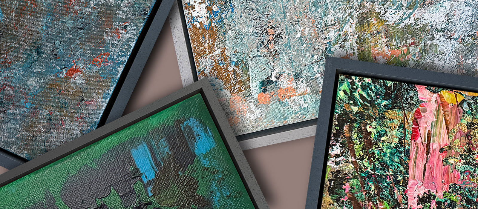
There’s a particular intent behind dividing a single image across multiple panels. Not three related pieces, but one composition that's deliberately interrupted, disconnected, yet joined.
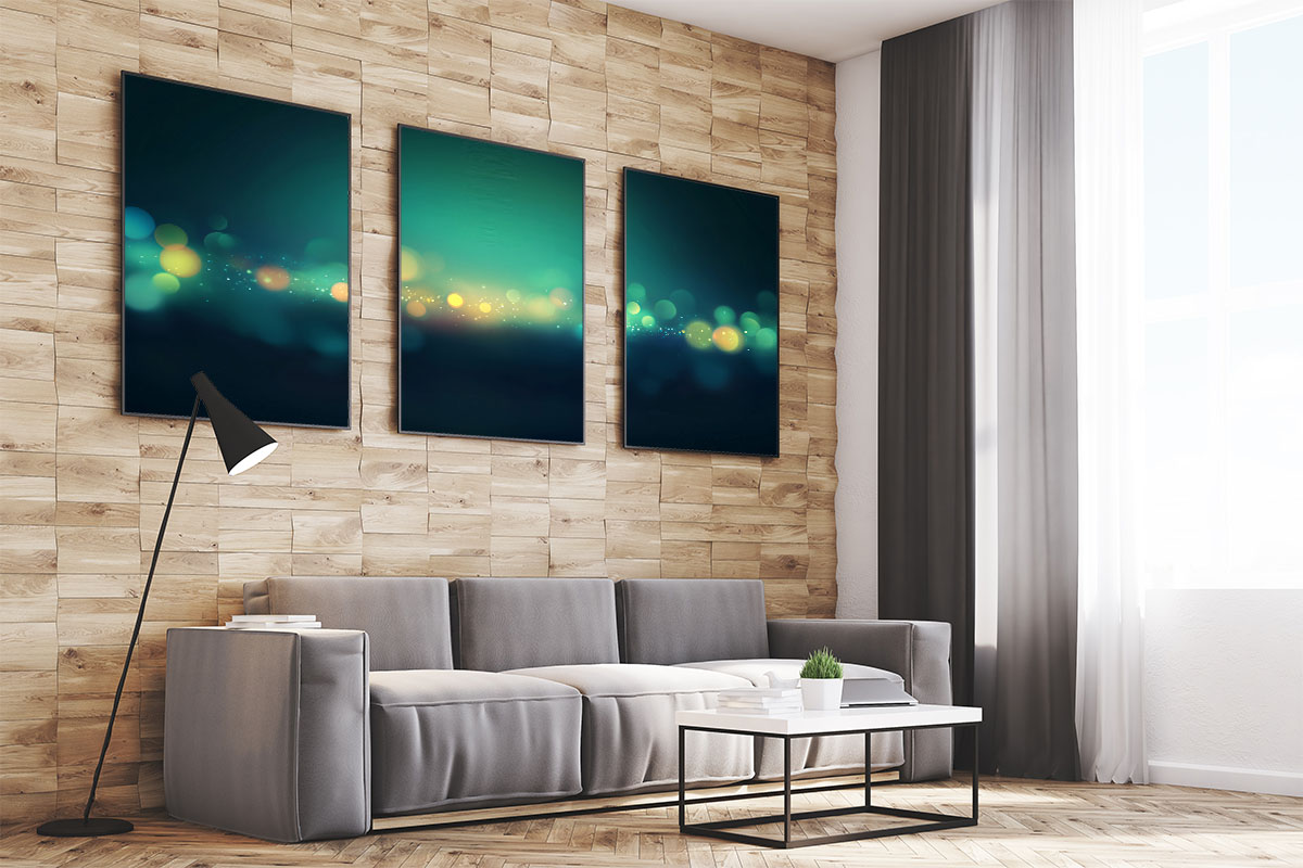
When an artwork is split, the wall stops being a backdrop and becomes part of the structure. The spacing introduces rhythm. The gaps create pauses that slow you down. The eye moves differently, reading the image in stages rather than all at once.
A continuous horizon, broken into sections, gains tension. An abstract composition that feels resolved on a single canvas can acquire a different energy when divided and allowed to breathe. The interruption sharpens the line, intensifies the colour, and gives negative space a role to play.
We call this a triptych, or a diptych when it’s two panels, but it isn’t about terminology. It’s about what happens when continuity is interrupted on purpose.
Sometimes the most interesting decision isn’t what you add to a room, but where you choose to break it.
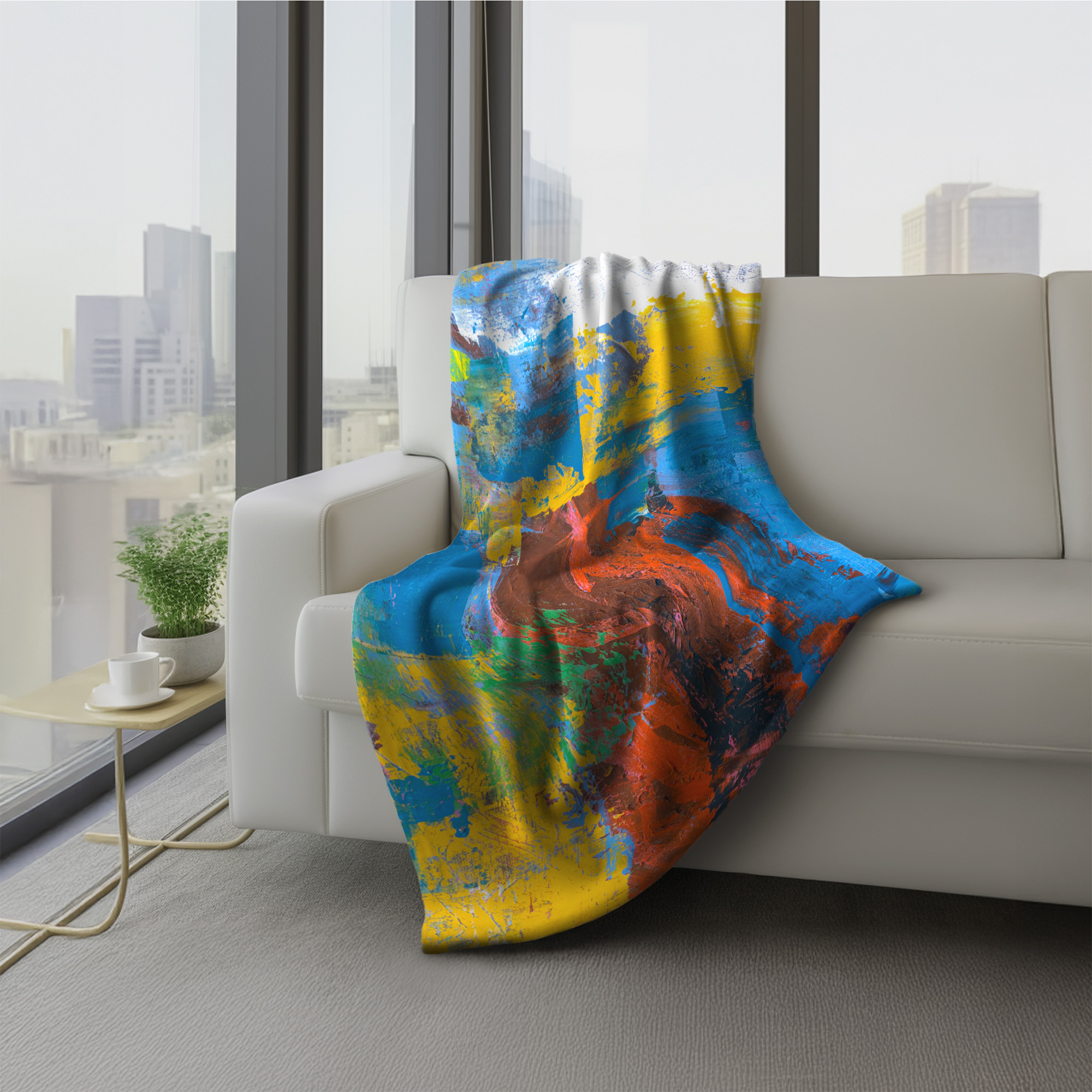
Art in Practice: When colour becomes the anchor
Have you noticed how a single piece of art can change the direction of an entire room? It’s often the first thing the eye is drawn to, and once seen, it sets the tone for everything else around it.
In this classic Victorian setting, the abstract artwork above the fireplace immediately shifts the atmosphere. It jars slightly, and that’s intentional.
Without it, the space would still feel formal and elegant, but perhaps a little restrained. The colour and movement in the piece introduce energy and contrast, and that alone would be enough to hold the room.
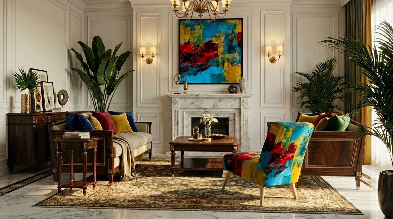
But it becomes more interesting when the artwork doesn’t stop at the wall.
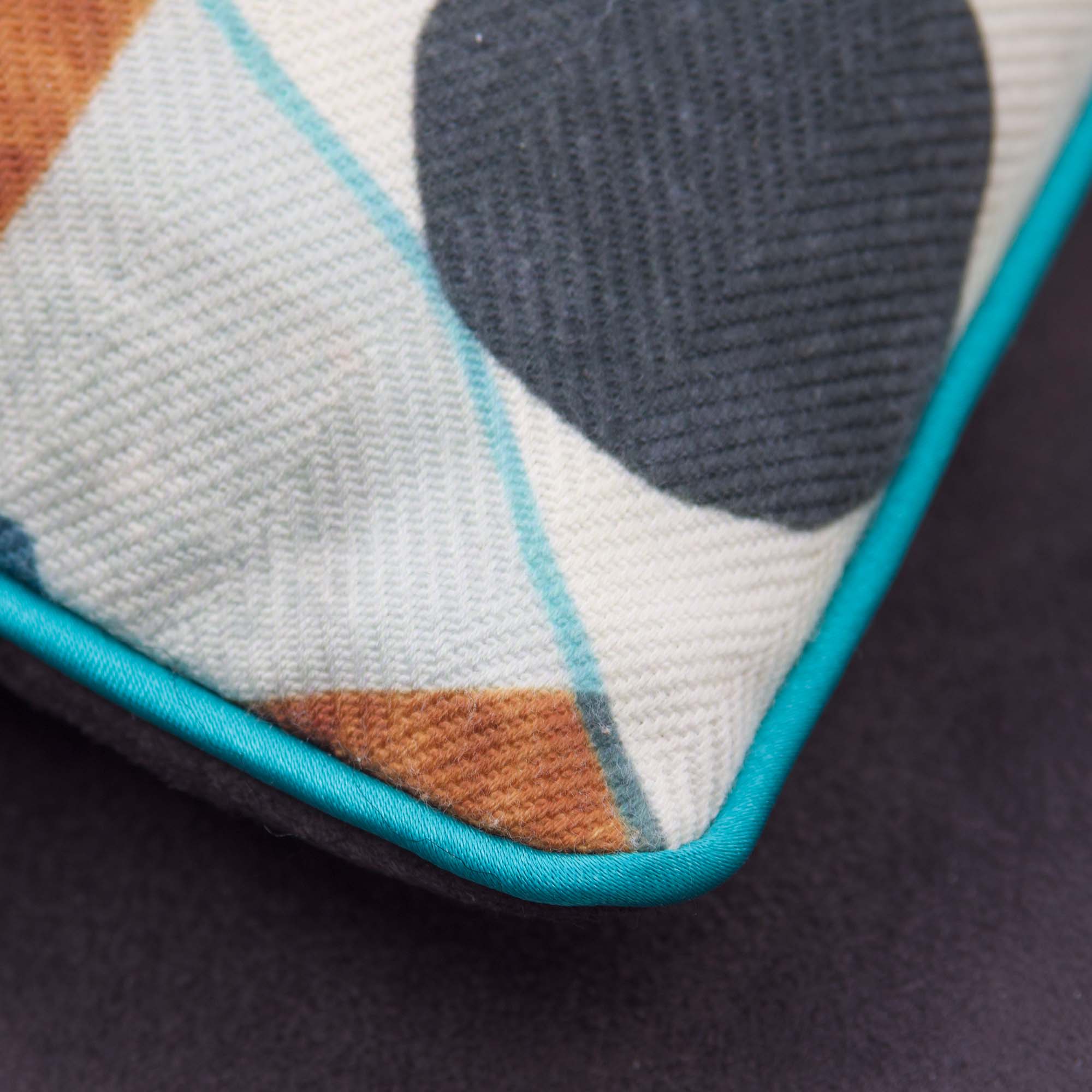
By upholstering the Slipper chair in the same design, and picking up hints of those colours in the cushions, the room starts to feel connected rather than simply contrasted. The art moves from being a focal point to becoming part of the structure of the space.
Matching everything perfectly can feel forced. But allowing colour to travel, to reappear in different forms, and to create a conversation between surfaces, now, that feels far more natural, and far more satisfying.
Journal Thoughts: The comfortable uncomfortable
In one of our recent Journal pieces, I wrote about show homes and why they often feel beautiful and aspirational, but somehow slightly untouchable.
Everything is balanced. Nothing is out of place. And yet something is missing.
Whereas real spaces, real homes, are quite different. They exude identity, they hold stories, accidents, experiences, and personality.
Art plays a powerful role here, not just as decoration, but as something that disrupts perfection in just the right way.
If you’re curious, you can read the full piece here: